Bravo
Logo Redesign
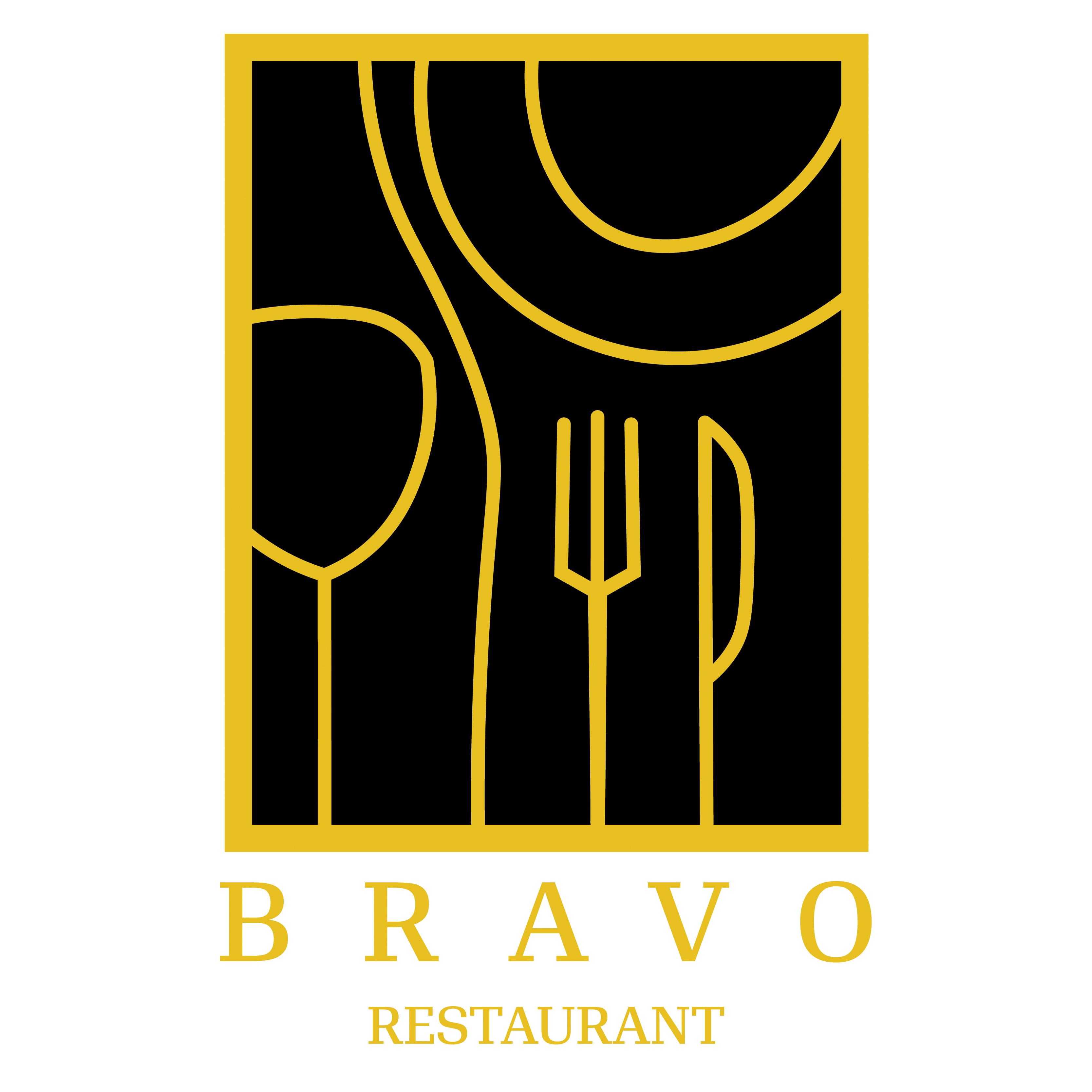
Objective
To redesign the restaurant’s logo and create a fresh new change to attract more customers.
Process
To me a good logo has to have some meaning behind it, it has to have
some symbolism to make it special and truly stand out. For me what
stood out was the location of the restaurant. It is between a pathway that leads to a park and a beautiful flowing river. So that’s what I based the logo on. The straight path is the pathway on the bottom the curved river at the top, and a bold lettering of the restaurant’s name. I continued to use the gold colouring but added a subtle gradient to it.
Truck + Menu
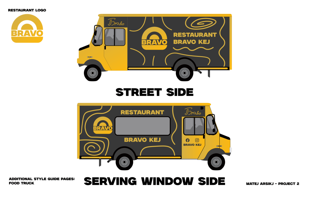
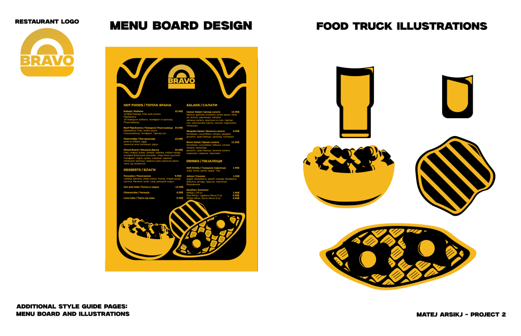
Objective
To create a design for a truck and a menu to go with it to attract more customers and spread the word.
Process
The restaurant is Macedonian, so I made the menu in both English and Macedonian, I had to balance it out so it could be readable in both languages. I continued to add abstract lines and go with the gold design. The gold colouring, makes it stand out and look luxurious to match the quality of the food and service.
Tools Used:
- Adobe Illustrator
